

There are many good mineral specimens.
But only a few truly hold your attention.
This is one of them.
A Dominant Center
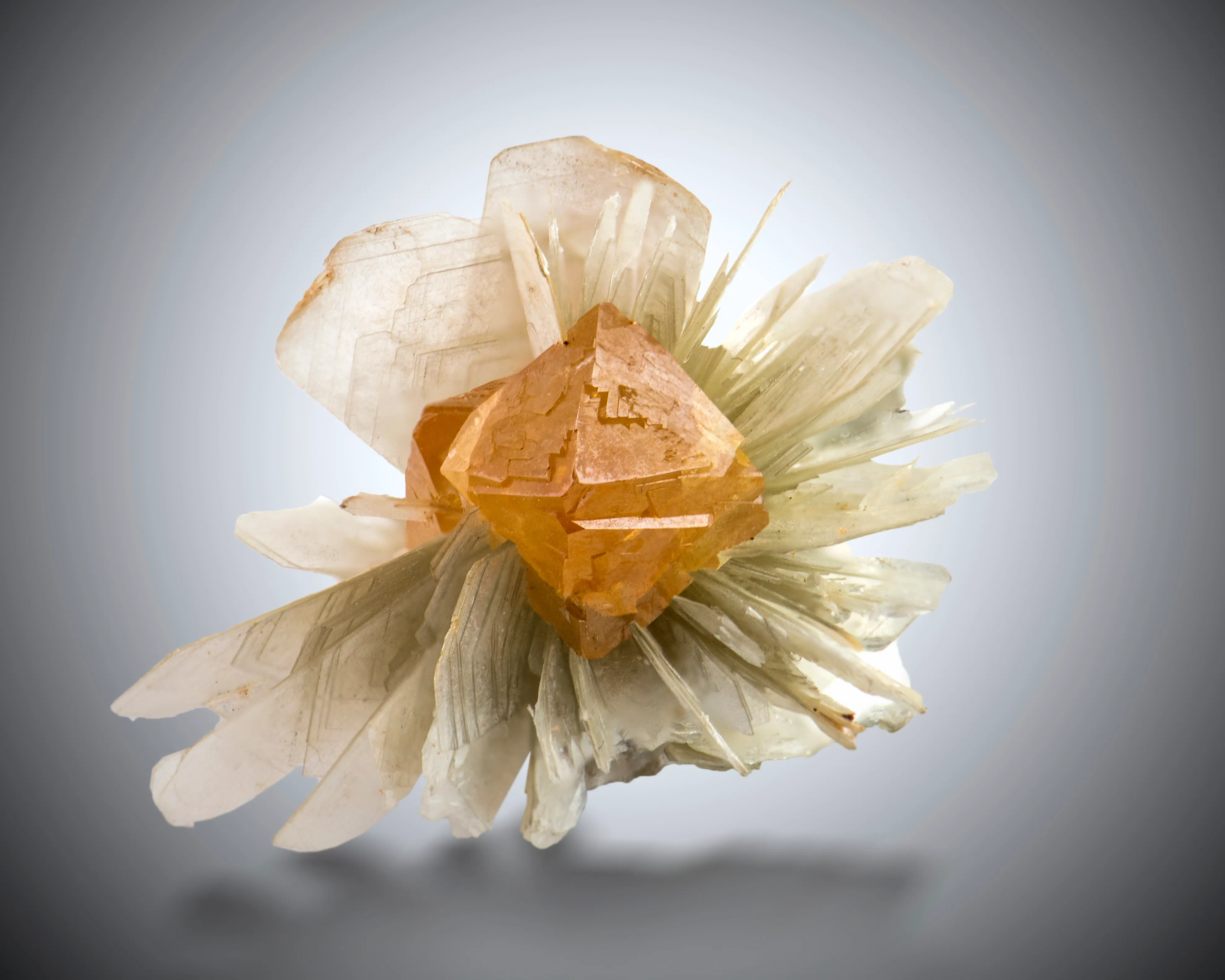
The eye immediately locks onto the orange-yellow scheelite at the center.
Its color is intense, almost luminous. Its geometry is compact and clearly defined.
It establishes a focal point that anchors the entire piece.
Everything else is secondary — and that is exactly what makes it work.
Contrast That Carries the Piece
The surrounding muscovite is pale, almost neutral in tone.
Its grey-white, layered structure spreads outward in a more diffuse, radial way. It does not compete with the scheelite — it frames it.
This creates a very deliberate contrast:
- saturated color against restraint
- solid form against layered texture
- visual weight against lightness
Without this contrast, the central crystal would lose much of its impact.
Structure and Direction
The muscovite is not just a background.
Its plate-like crystals create direction. They guide the eye toward the center and reinforce the presence of the scheelite.
There is movement in the matrix — but it all resolves in a single point.
Balance Without Perfection
The composition is not symmetrical.
The scheelite is slightly offset. The muscovite spreads unevenly.
And yet, the piece feels balanced.
That tension between order and irregularity makes it feel natural — and keeps it visually alive.
Why I Chose It
I did not choose this specimen because of rarity or locality.
I chose it because it works.
Because the central crystal holds the eye. Because the matrix supports without distraction. Because the composition remains compelling, even after repeated viewing.
For me, that is the only criterion that matters.